Design Systems
Design Systems
Design Systems
Design Systems
Design Systems
Design systems work across fintech, web3, gaming, and enterprise platforms. Each project is different: different team size, different maturity, different constraints. What stays consistent is the approach: start with what exists, understand how it fails, and build something the team will actually use.
Over the past few years, I’ve worked on design systems across fintech, web3, and platform products. Each project taught me that systems are more than shared components. They’re living frameworks that align teams, scale creativity, and keep products consistent as they grow.
Over the past few years, I’ve worked on design systems across fintech, web3, and platform products. Each project taught me that systems are more than shared components. They’re living frameworks that align teams, scale creativity, and keep products consistent as they grow.
Over the past few years, I’ve worked on design systems across fintech, web3, and platform products. Each project taught me that systems are more than shared components. They’re living frameworks that align teams, scale creativity, and keep products consistent as they grow.
Over the past few years, I’ve worked on design systems across fintech, web3, and platform products. Each project taught me that systems are more than shared components. They’re living frameworks that align teams, scale creativity, and keep products consistent as they grow.
Gaming & Creator Tools | Web, Mobile, Desktop | 2024–2026
Gaming & Creator Tools | Web, Mobile, Desktop | 2024–2026
Gaming & Creator Tools | Web, Mobile, Desktop | 2024–2026
Gaming & Creator Tools | Web, Mobile, Desktop | 2024–2026
Gaming & Creator Tools | Web, Mobile, Desktop | 2024–2026
Roblox
Roblox
Roblox
Scaling a design system from early-stage development to production-ready infrastructure, 61 product teams, millions of users, and four platforms. Consolidating legacy libraries and establishing governance while the product continued to ship.
Work protected by NDA.
Scaling a design system from early-stage development to production-ready infrastructure, 61 product teams, millions of users, and four platforms. Consolidating legacy libraries and establishing governance while the product continued to ship.
Work protected by NDA.
Scaling a design system from early-stage development to production-ready infrastructure, 61 product teams, millions of users, and four platforms. Consolidating legacy libraries and establishing governance while the product continued to ship.
Work protected by NDA.
Scaling a design system from early-stage development to production-ready infrastructure, 61 product teams, millions of users, and four platforms. Consolidating legacy libraries and establishing governance while the product continued to ship.
Work protected by NDA.
Scaling a design system from early-stage development to production-ready infrastructure, 61 product teams, millions of users, and four platforms. Consolidating legacy libraries and establishing governance while the product continued to ship.
Work protected by NDA.

B2B SaaS | Platform | 2024
B2B SaaS | Platform | 2024
B2B SaaS | Platform | 2024
B2B SaaS | Platform | 2024
Condo Control
Condo Control
Condo Control
A complete platform transformation, rebrand, design system, and UX restructure across a property management platform, all running in parallel. Led brand transformation and design system validation through a full product rebuild.
Work protected by NDA.
A complete platform transformation, rebrand, design system, and UX restructure across a property management platform, all running in parallel. Led brand transformation and design system validation through a full product rebuild.
Work protected by NDA.
A complete platform transformation, rebrand, design system, and UX restructure across a property management platform, all running in parallel. Led brand transformation and design system validation through a full product rebuild.
Work protected by NDA.
A complete platform transformation, rebrand, design system, and UX restructure across a property management platform, all running in parallel. Led brand transformation and design system validation through a full product rebuild.
Work protected by NDA.
Fintech | Mobile & Responsive Web | 2023
Fintech | Mobile & Responsive Web | 2023
Fintech | Mobile & Responsive Web | 2023
Fintech | Mobile & Responsive Web | 2023
Fintech | Mobile & Responsive Web | 2023
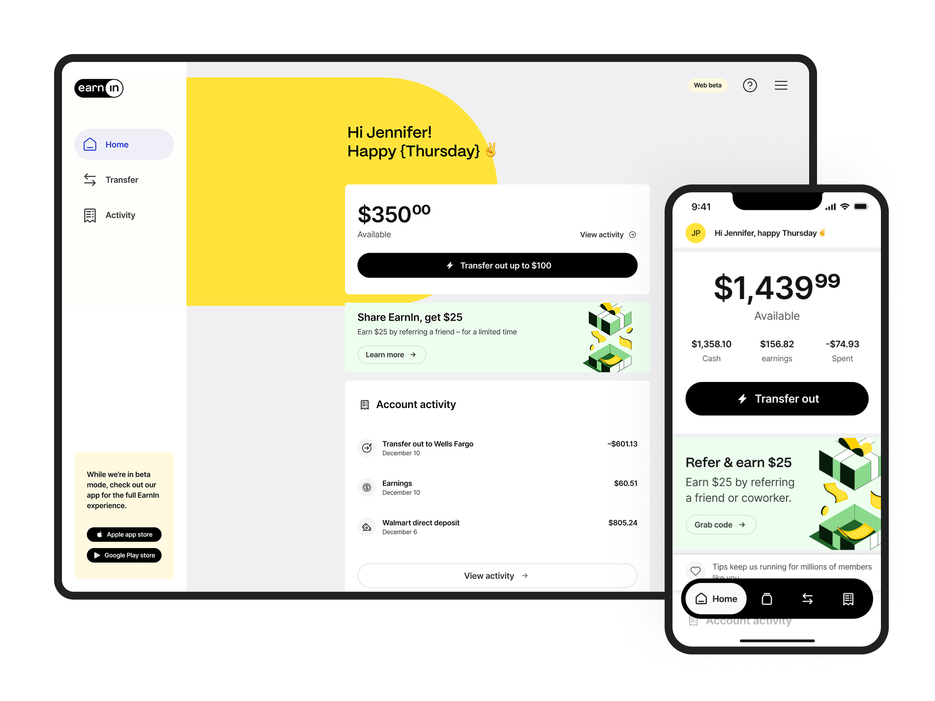
Earnin
Earnin
Earnin
Rapid growth and a major rebrand at the same time, the system had to keep up with both. Built the pattern library that unified mobile and web under a new identity while the product was still shipping.
Rapid growth and a major rebrand at the same time, the system had to keep up with both. Built the pattern library that unified mobile and web under a new identity while the product was still shipping.
Rapid growth and a major rebrand at the same time, the system had to keep up with both. Built the pattern library that unified mobile and web under a new identity while the product was still shipping.
Rapid growth and a major rebrand at the same time, the system had to keep up with both. Built the pattern library that unified mobile and web under a new identity while the product was still shipping.
Rapid growth and a major rebrand at the same time, the system had to keep up with both. Built the pattern library that unified mobile and web under a new identity while the product was still shipping.

Fintech | Mobile & Responsive Web | 2022
Fintech | Mobile & Responsive Web | 2022
Fintech | Mobile & Responsive Web | 2022
Fintech | Mobile & Responsive Web | 2022
Fintech | Mobile & Responsive Web | 2022
Affirm
Affirm
Affirm
Taking a design system global means more than translating copy. Expanding into the UK and Canada required design patterns that could handle localisation, regulatory constraints, and language support without fragmenting the product.
Taking a design system global means more than translating copy. Expanding into the UK and Canada required design patterns that could handle localisation, regulatory constraints, and language support without fragmenting the product.
Taking a design system global means more than translating copy. Expanding into the UK and Canada required design patterns that could handle localisation, regulatory constraints, and language support without fragmenting the product.
Taking a design system global means more than translating copy. Expanding into the UK and Canada required design patterns that could handle localisation, regulatory constraints, and language support without fragmenting the product.
Taking a design system global means more than translating copy. Expanding into the UK and Canada required design patterns that could handle localisation, regulatory constraints, and language support without fragmenting the product.
Web3 | Mobile & Responsive Web | 2023
Web3 | Mobile & Responsive Web | 2023
Web3 | Mobile & Responsive Web | 2023
Web3 | Mobile & Responsive Web | 2023
EigenLayer
EigenLayer
EigenLayer
EigenLayer
EigenLayer
A bold visual identity is easy to build in isolation. Making it functional, accessible, and consistent across light and dark contexts at product scale is a different problem entirely.
A bold visual identity is easy to build in isolation. Making it functional, accessible, and consistent across light and dark contexts at product scale is a different problem entirely.
A bold visual identity is easy to build in isolation. Making it functional, accessible, and consistent across light and dark contexts at product scale is a different problem entirely.
A bold visual identity is easy to build in isolation. Making it functional, accessible, and consistent across light and dark contexts at product scale is a different problem entirely.
A bold visual identity is easy to build in isolation. Making it functional, accessible, and consistent across light and dark contexts at product scale is a different problem entirely.

My approach and work
My approach and work
My approach and work
My Philosophy: Systems as Products
My Philosophy: Systems as Products
My Philosophy: Systems as Products
I focus not only on building components but also on the strategic alignment of design, engineering, and business objectives. This means defining token architecture, governance models, and cross-functional workflows that connect design, code, and business objectives.
Every system I build is validated through real use, not just theoretical patterns. The best systems are those that people want to use because they make their work better, easier, and more effective.
Discovery and Audit
Discovery and Audit
Discovery and Audit
Discovery and Audit
Every project begins with understanding what already exists before proposing what comes next. This discovery phase helps uncover real problems, build alignment, and gain stakeholder trust.
Component Audit. I review Figma organisation, component usage, and assets to identify redundancies and gaps that require new or custom components.
Handoff Friction. I run collaborative sessions with design, engineering, and product teams to surface workflow bottlenecks and ensure smooth implementation and adoption.
Visual Consistency. I analyse current brand identity, identify inconsistencies, and translate evolving brand goals into a clear, scalable token structure.
Architecture and Strategy
Architecture and Strategy
Architecture and Strategy
Architecture and Strategy
Architecture and Strategy
I design systems that balance technical alignment, design usability, and long-term maintainability. Using an atomic approach, components are built from foundational elements like buttons, icons, and typography, then scaled into complex patterns including cards, modals, and navigation.
Key principle: keep structures simple. Minimising nested instances makes systems easier to maintain, debug, and hand off, keeping both files and workflows efficient.
Build and Validate
Build and Validate
Build and Validate
Build and Validate
I build flexible, reusable components and test them under real product conditions. Starting with atomic elements like buttons and inputs, I scale to increasingly complex patterns, including cards, forms, calendars, and navigation.
Each component is designed for flexibility, allowing teams to adapt patterns without breaking the system. I validate components by applying them to actual product features, ensuring they work under real-world pressure before wider adoption. Responsive behaviour and platform requirements are documented and tested across devices, enabling teams to ship consistent experiences that scale.
Collaboration and Handoff
Collaboration and Handoff
Collaboration and Handoff
Even the strongest system fails without adoption. Successful systems are built on relationships, not just rules. I focus on creating open, collaborative spaces where teams can voice needs, share feedback, and shape how the system evolves together.
Because a design system only succeeds when it is something the whole team believes in and uses every day.