Platform, Design System
EigenLayer
EigenLayer serves as a developer platform for Ethereum users, enhancing software safety, supporting Ethereum's growth, and simplifying the testing and execution of new ideas. As EigenLayer's influence in the Ethereum ecosystem grew, there was a clear need for a cohesive, intuitive user experience across its products.
EigenLayer serves as a developer platform for Ethereum users, enhancing software safety, supporting Ethereum's growth, and simplifying the testing and execution of new ideas. As EigenLayer's influence in the Ethereum ecosystem grew, there was a clear need for a cohesive, intuitive user experience across its products.
Project summary
I led the visual direction and product design for EigenLayer's design system, establishing the look and feel, running the audit, and designing all product screens to stress-test the system under real use. A colleague on the Forge team focused on building the component library. The result was a comprehensive toolkit covering design guidelines, tokens, components, and documentation, enabling developers and designers to build consistent interfaces aligned with EigenLayer's brand standards.
Expertise
Experties
Product Design
UI/UX Design
Design System
Design Tokens
Deliverables
Product design
Design system
Token library
Component library
Design guidelines and documentation
Platforms
Desktop
Table
Mobile
Year
2023
2023
The Challenge
The challenge was to build a design system that aligned with EigenLayer's existing brand, a visual direction rooted in Brutalism, with high-contrast colours, bold typography, and strong use of scale. Translating that into a usable product interface meant keeping the visual intensity while prioritising usability and responsiveness at every decision point.
An additional layer of complexity: the brand allows for a variety of background colours rather than a conventional light and dark mode. Every component needed to work across multiple background contexts within the same system.
Audit
Before any visual exploration, I audited EigenLayer's existing platform and marketing website to understand their current branding and design patterns. This grounded every subsequent decision in what already existed, ensuring proposed changes would integrate with the established brand identity rather than work against it.
Before any visual exploration, I audited EigenLayer's existing platform and marketing website to understand their current branding and design patterns. This grounded every subsequent decision in what already existed, ensuring proposed changes would integrate with the established brand identity rather than work against it.
Establishing Visual directions
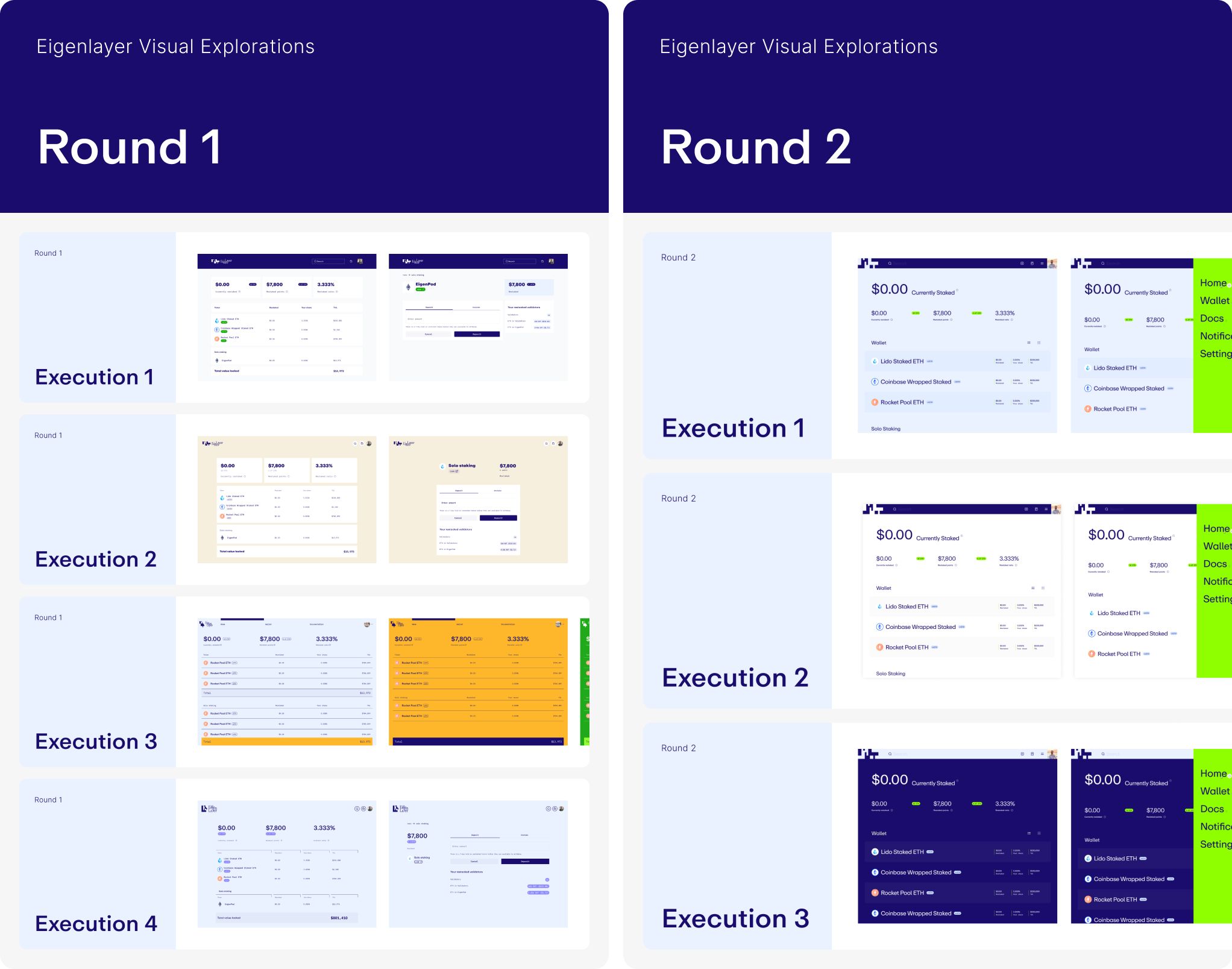
While a colleague focused on building the design components, I led visual explorations informed by audit findings and client communication. Within two rounds of iteration, we established a new look and feel for the product, high contrast, bold typography, and a system that felt native to the brand without sacrificing usability.
While a colleague focused on building the design components, I led visual explorations informed by audit findings and client communication. Within two rounds of iteration, we established a new look and feel for the product, high contrast, bold typography, and a system that felt native to the brand without sacrificing usability.
While a colleague focused on building the design components, I led visual explorations informed by audit findings and client communication. Within two rounds of iteration, we established a new look and feel for the product, high contrast, bold typography, and a system that felt native to the brand without sacrificing usability.
Solution
To align with brand guidelines, the system incorporates high contrast across both typography and colour.
Key decisions:
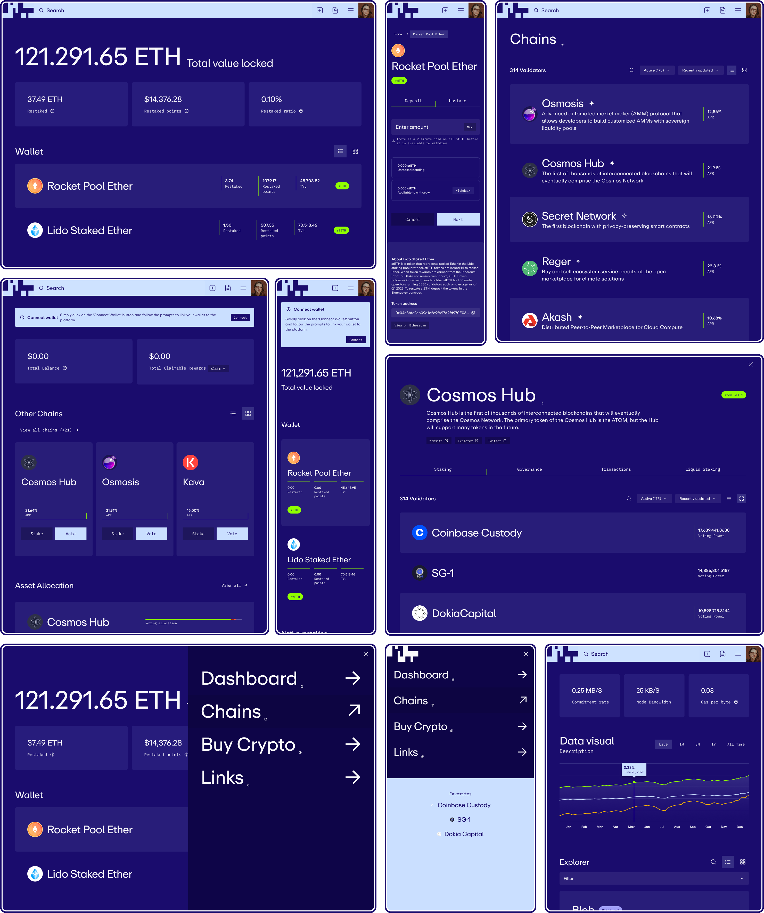
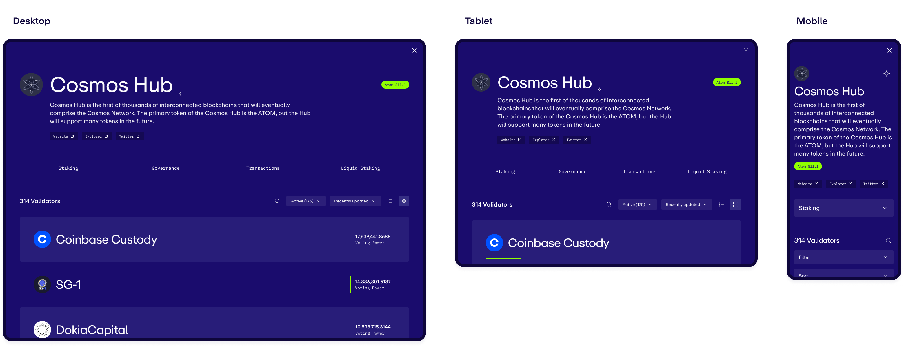
High contrast navigation with an enlarged search bar, built to accommodate both light and dark interface contexts. Blown-out typography within list items, prioritising searchability and readability over dense tables, with the ability to switch between list and card views. Accent colours used strategically as backgrounds for informative tags and dividers, giving the product the visual punch of the brand without overwhelming the interface.
Establish the Foundations
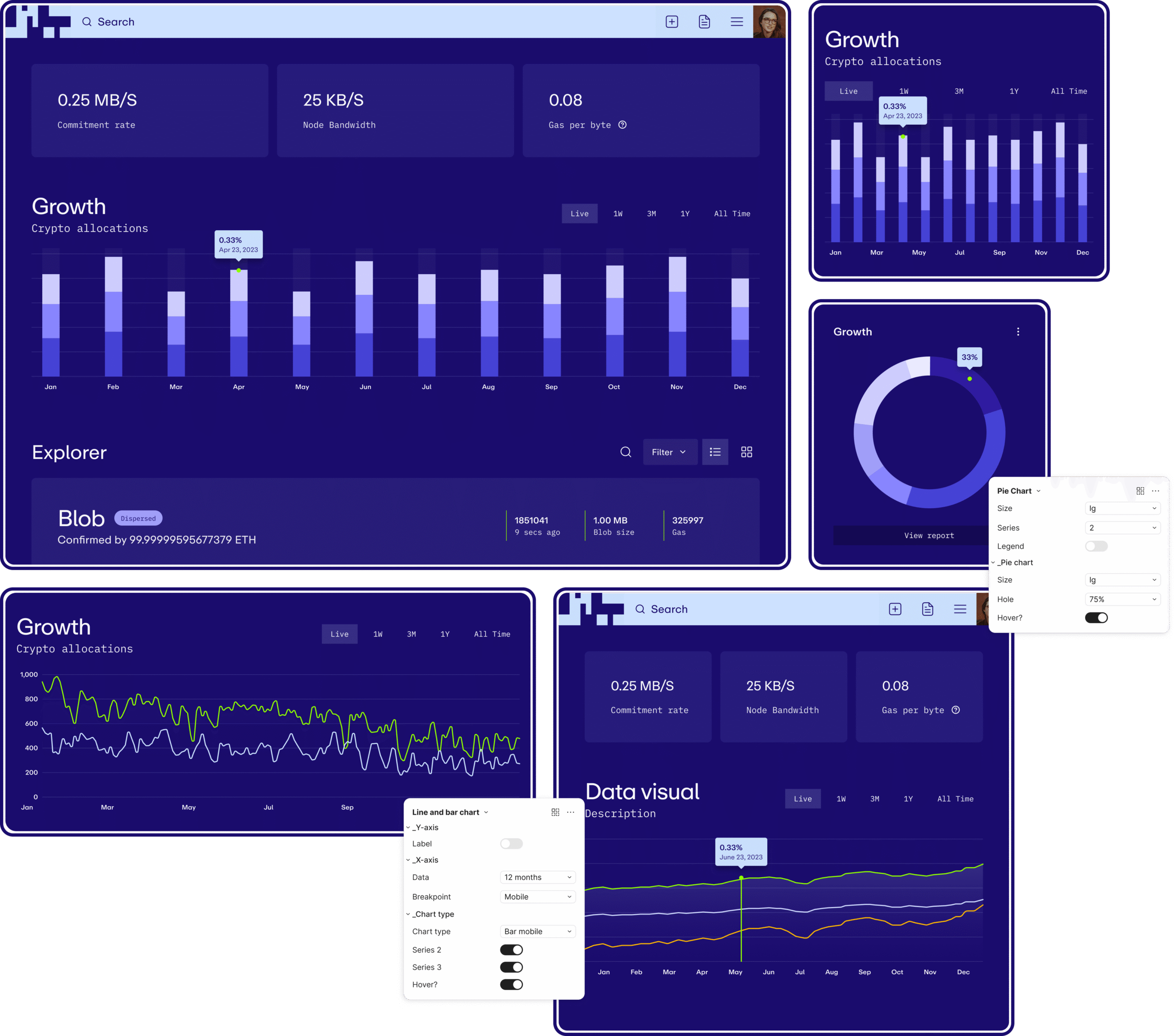
All foundational styles are documented with their design token names and values, covering both global and semantic values. Foundations include colour primitives, colour semantic usage, typography, sizing, grids, border radius, border width, spacing, shadows, and effects.
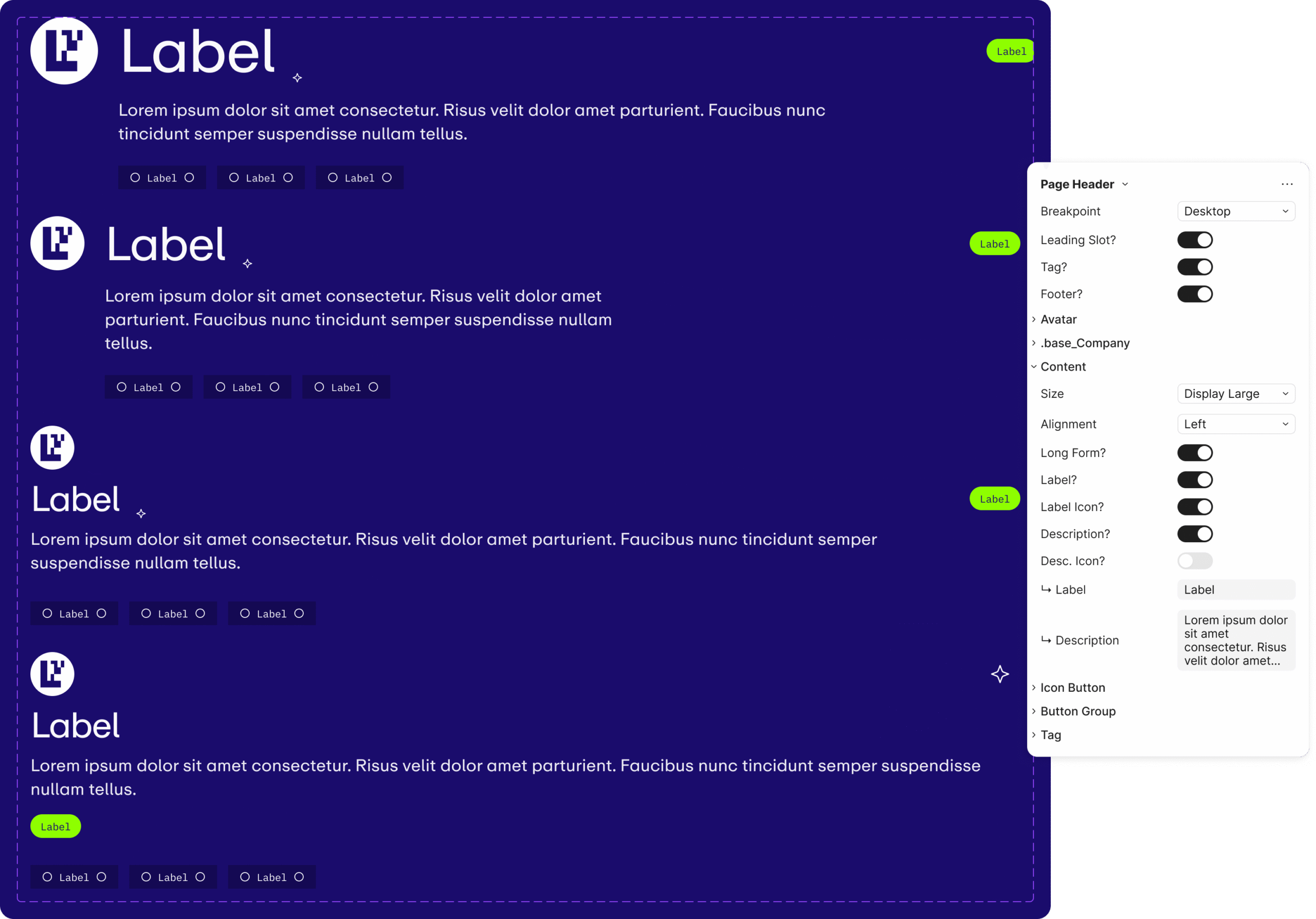
Creating Easy-to-Use Components
Components are aligned with code and built atomically, from simple elements like buttons and inputs up to more complex patterns, much like building blocks. Each component is designed to be flexible enough to handle future use cases without breaking. The UX of the design panel in Figma was also considered throughout, so components are easy to work with in practice, not just in theory.
Data Visuals
A data visual component built for flexibility, designers can adjust information on each axis, the number of data points displayed, and the type of visualisation needed. The hover data point height can be adjusted precisely without breaking the component. All breakpoints are included.
Accounting for Responsiveness
Large typography required clear documentation of how it adapts from desktop to mobile, with size reductions documented at each breakpoint. Component behaviour at smaller screen sizes is also illustrated: tabs collapsing into dropdown selections, layouts adjusting for available space.
Documentation
Comprehensive documentation covers how components should be used, how they relate to each other, and the UX patterns and templates that bring them together. The goal is to foster a shared understanding across design and engineering, so the system can be used consistently without constant interpretation.

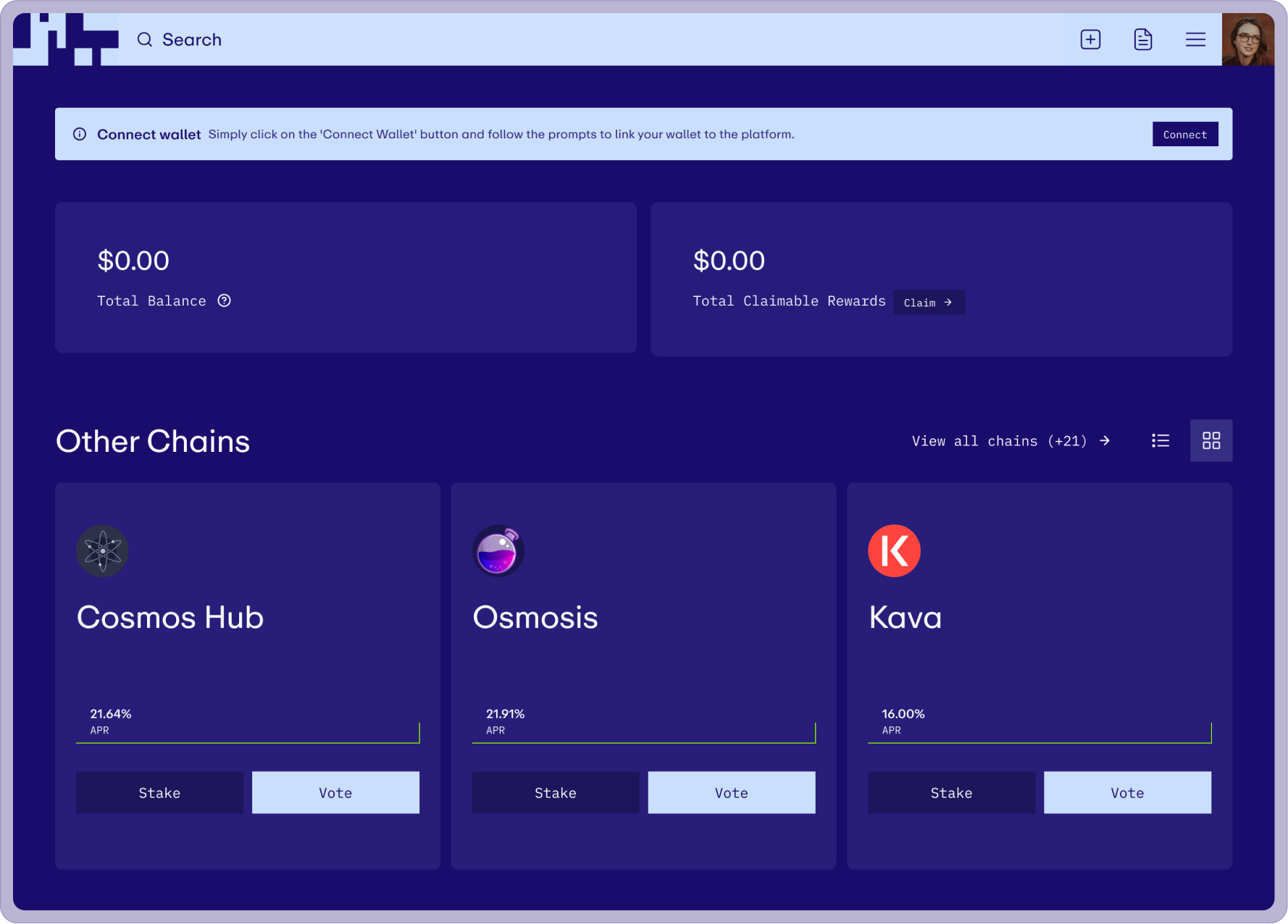
Product Views
All product screens were designed to stress-test the system, ensuring it could handle the full range of interface requirements and that every custom component was accounted for. The views validate the system under real product conditions rather than hypothetical ones.
More projects
Earnin
With rapid growth and a major rebrand at the same time, the system had to keep up with both. Built the pattern library that unified mobile and web under a new identity while the product was still shipping.
Affirm
Taking a design system global means more than translating copy. Expanding into the UK and Canada required design patterns that could handle localisation, regulatory constraints, and language support without fragmenting the product.