Mobile, Platform, Design System
EarnIn
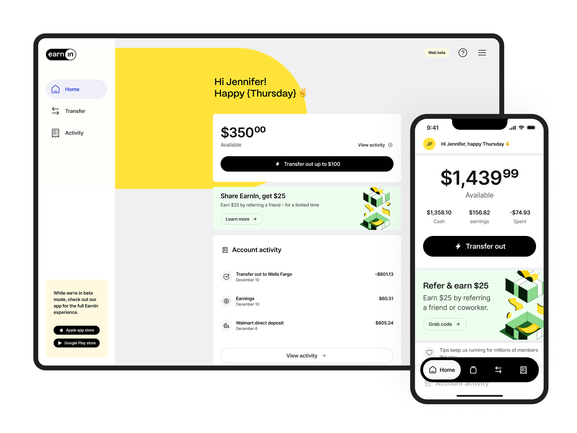
EarnIn underwent a major rebrand while launching its first responsive web product. As part of the Forge team, I focused on brand translation, pattern library development, product validation, and team enablement, contributing to a multi-brand design system anchored on 356 tokens, 754 components, and 6,083 variants across seven libraries.
Project summary
EarnIn was mid-rebrand, growing fast, and operating with a single mobile app while a web product was on the roadmap. The design team was new to Figma. Every rebrand decision carried downstream consequences across iOS, Android, and a planned web product that didn't exist yet. The system needed to absorb the rebrand and enable the web channel simultaneously.
My role: Design Systems Contributor and Product Designer
Team: 3-person Forge team
Expertise
Expertise
Audit
Design Systems
Design Operations
Product Strategy
UI/UX Design
Deliverables
Design system
Product design
Year
2022 - 2023
2022 - 2023
Discovery and Brand Translation
Component Audit
Audited file organisation, component usage, and team workflows, identifying inconsistencies, duplication, and gaps blocking web expansion. Collaborative sessions with leads across design, engineering, and product surfaced handoff friction and shaped the requirements for the new system.
Brand Translation
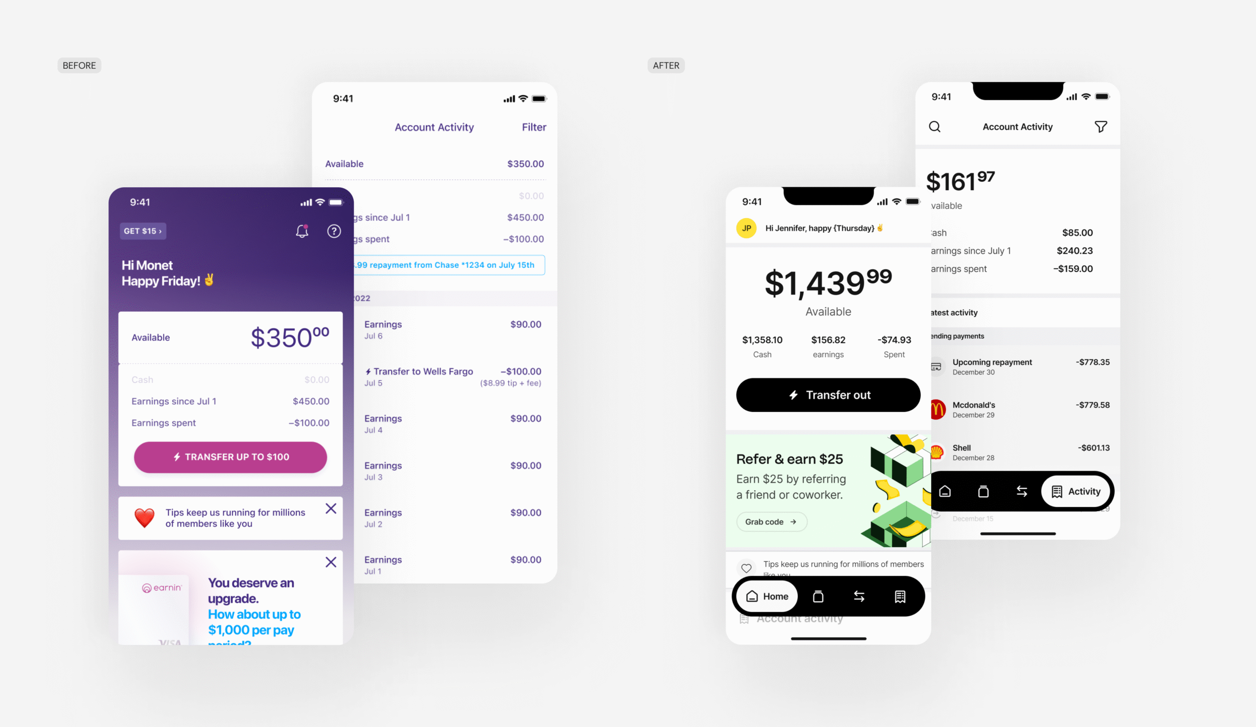
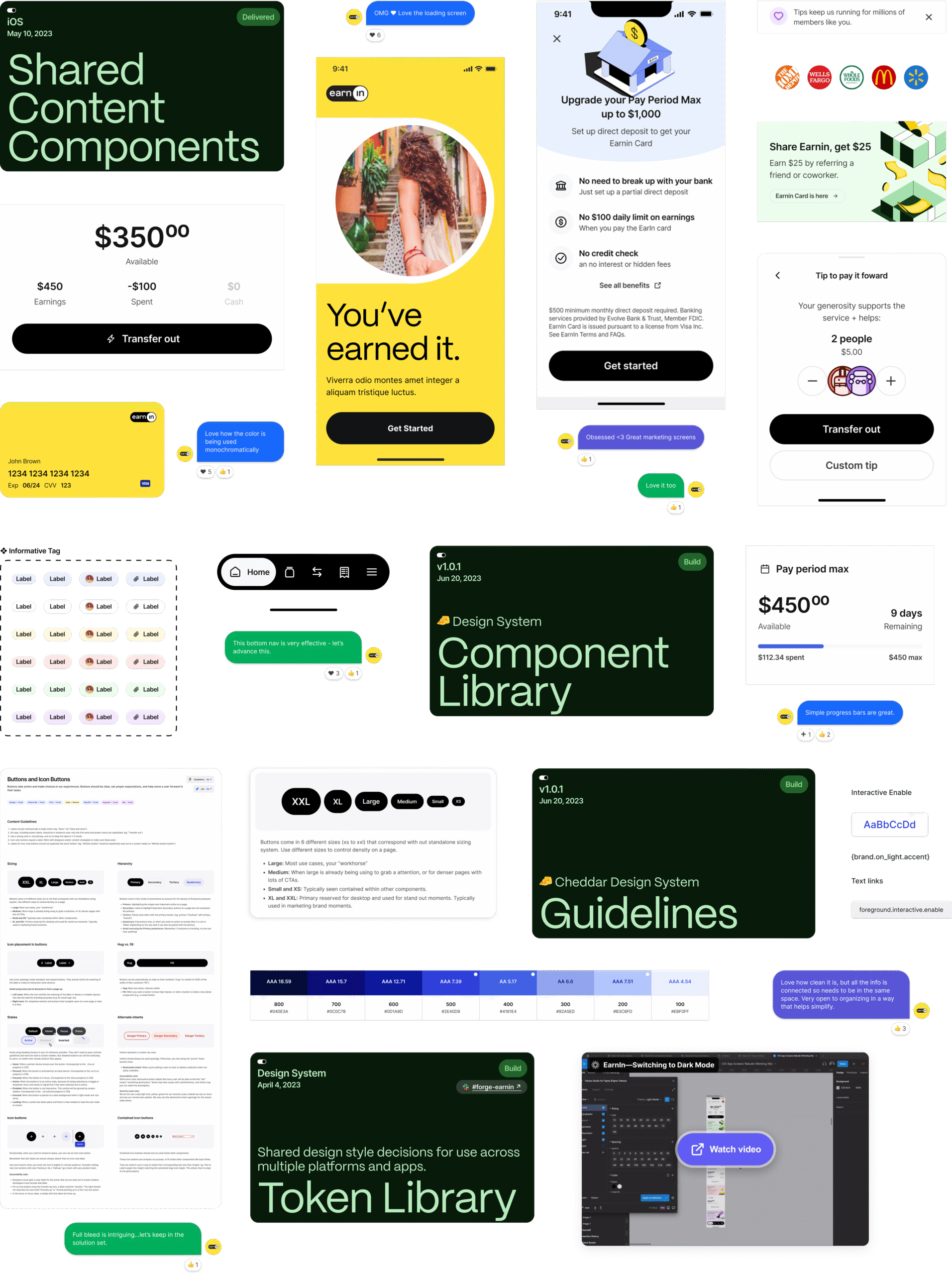
Translated the new brand identity into systematic design patterns, establishing the foundation for pattern library development. The approach explored two directions: a conservative option with minimal brand volume, and a bolder direction leaning into the dynamic combination of primary yellow and black. The team chose the conservative direction, but brand moments were intentionally placed throughout the product, so the effect was stronger through contrast than through saturation.
Pattern Library
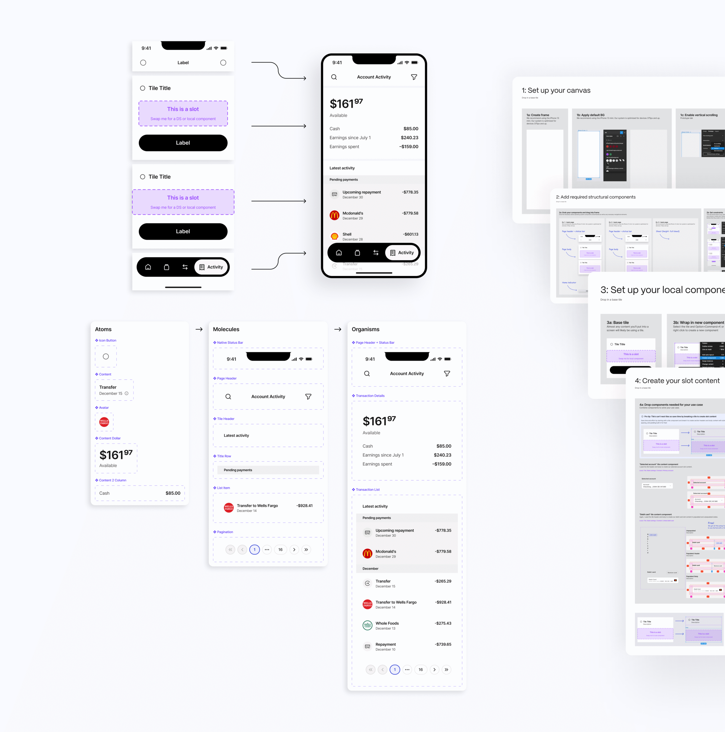
Built a pattern library demonstrating systematic screen construction using the design system's hierarchical components, from foundational elements to complex patterns. Starting from atomic elements like content, buttons, icons, and avatars, I scaled to more complex components: cards, sheets, modals, and lists.
The card-and-slot strategy reduced cognitive load for designers new to Figma while enforcing a consistent hierarchy. Cards act as the primary container with a header, body slot, and footer. Designers build body content as a local component and swap it in, flexible enough to handle any use case, structured enough to stay consistent.
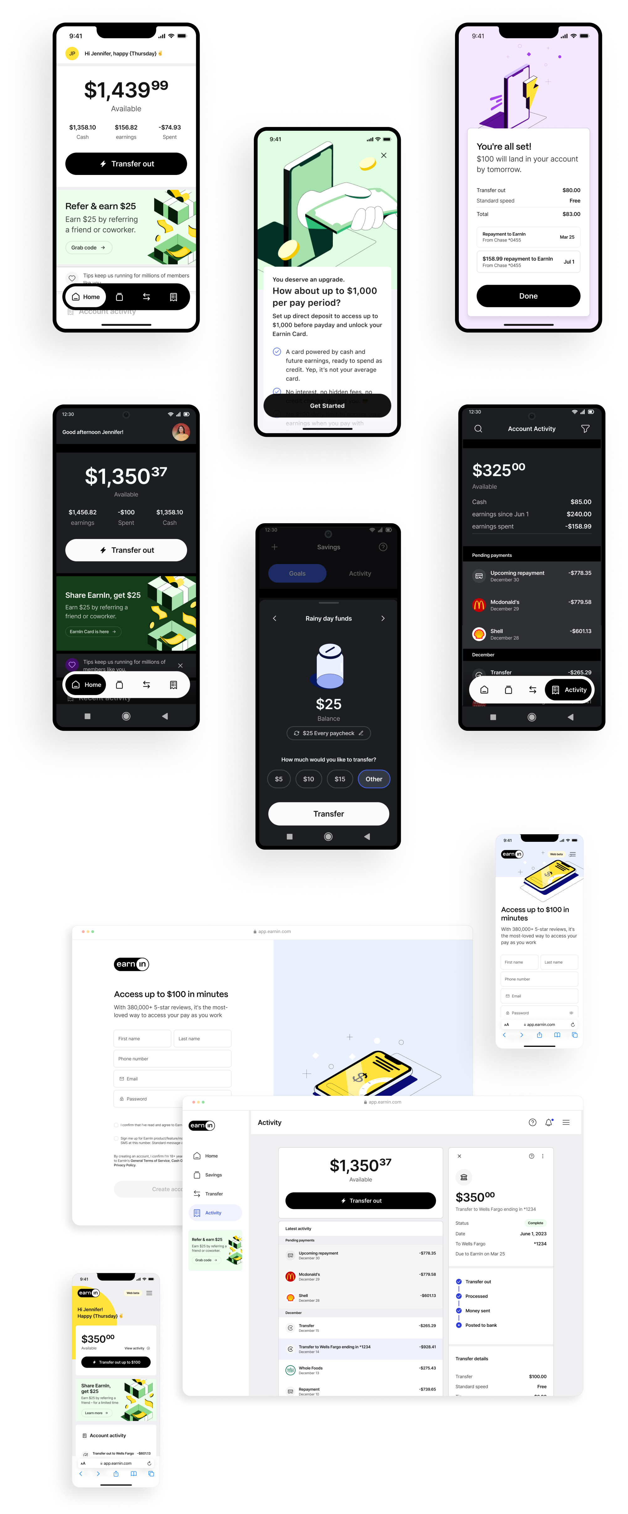
The library validated system flexibility across mobile and web, and provided reusable templates enabling EarnIn designers to build efficiently with the new system.
Design Team Enablement
Contributed to adoption workshops and step-by-step guides showing designers how to build screens using the pattern library and systematic component approach. Materials supported team onboarding and established consistent workflows for using the design system. Token Studio managed token architecture and synchronised styles across Figma and GitHub, with light and dark mode switching requiring just two token changes to update every component simultaneously.
Cross-Platform Validation
Supported the first responsive web product launch, applying the pattern library across platforms and validating component flexibility from mobile to web. The same systematic approach and consistent experience across both platforms, with only a small number of new components required for the web channel.
Impact
Unified design system across mobile and web platforms. Pattern library providing systematic, reusable components. Design team adoption is enabled through workshops and guides. Consistent brand identity translated across all products. Scalable foundation supporting future product expansion.
"Love how the color is being used monochromatically." — Product Brand Design Leader, EarnIn
More projects
Affirm
Taking a design system global means more than translating copy. Expanding into the UK and Canada required design patterns that could handle localisation, regulatory constraints, and language support without fragmenting the product.
EigenLayer
A bold visual identity is easy to build in isolation. Making it functional, accessible, and consistent across light and dark contexts at product scale is a different problem entirely.