Webplatform, Design System
Webprints
A startup building a vibrant 3D printing community — a social platform where users discover, share, and print 3D projects. The goal was a design system flexible enough to support rapid feature development, new themes, and future product expansion without compromising consistency.

Project summary
I led the visual direction and product design for Webprints, establishing the look and feel of the MVP, working closely with stakeholders throughout, and testing design system components against real product screens. A colleague on the Forge team focused on the DS foundations, token architecture, and component library. The result was a platform-agnostic, themeable design system with close alignment between design and code.
Expertise
Header 4
Design System
Product strategy
Product design
UI/UX Design
Deliverables
Product design
Design System
Component library
Design guidelines
Links
Year
2023
2023
The Challenge
The design system needed to be easy to use, aligned with code, and flexible enough to support new features, themes, and eventually new products without requiring a rebuild from scratch.
The Solution
A versatile, platform-agnostic design system built for theming from the start. Token Studio managed foundational styles, syncing with GitHub so design and engineering stayed in sync. Tokens applied directly in Figma made theme switching seamless. The system maintains styles Figma doesn't natively support: border width, border radius, spacing, sizing, and more.
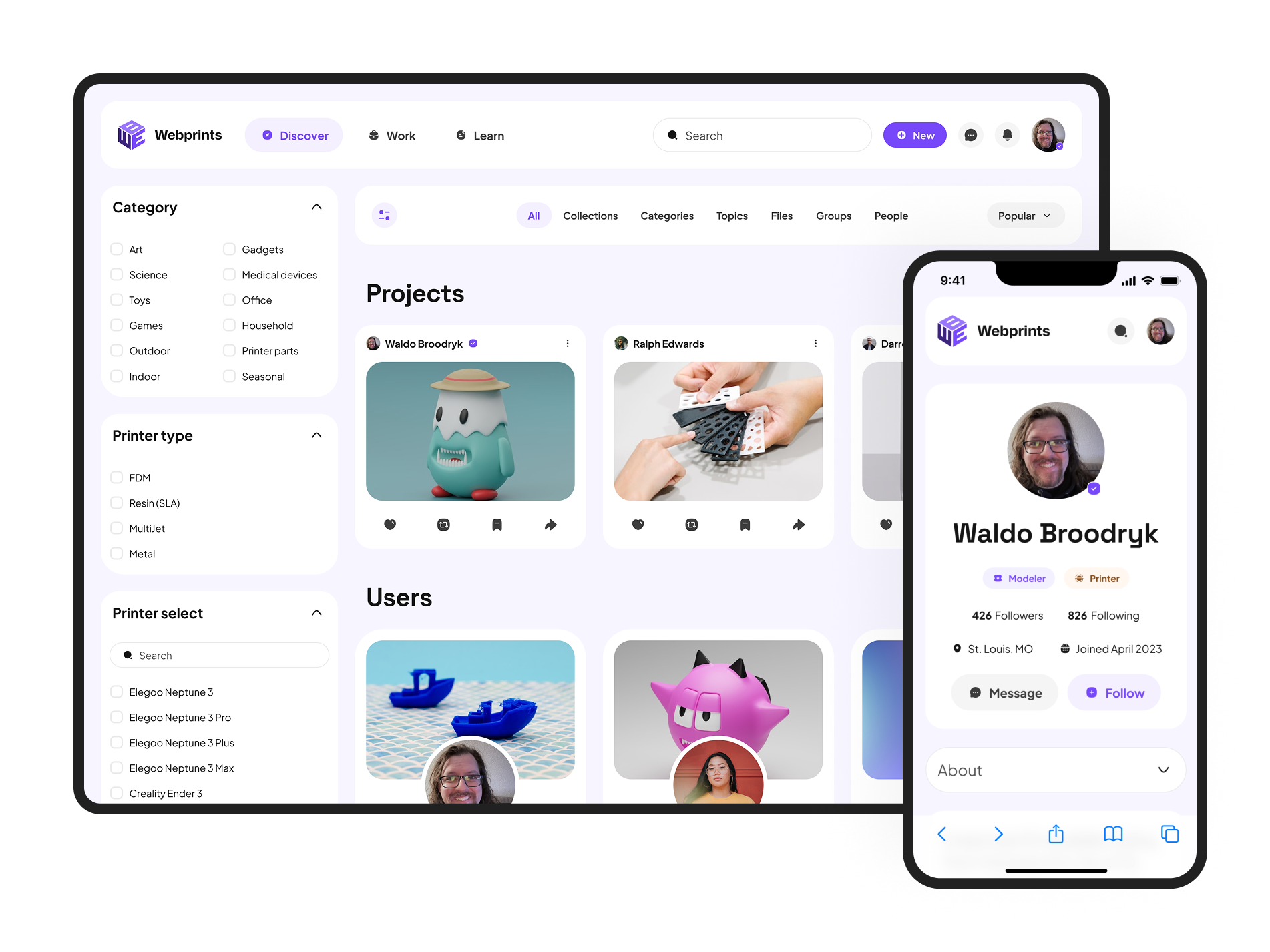
Visualizing the MVP
Working closely with the founders, I established the visual direction for the MVP, translating their vision into a user-friendly, on-brand, and accessible design. The process covered colour schemes, typography, and iconography, creating a cohesive visual identity that could serve as the foundation for the product's ongoing evolution.
The visual direction work ran in parallel with the DS foundations. As the system took shape, I tested components against real product screens to validate they worked under actual use conditions, surfacing gaps before they became problems in production.
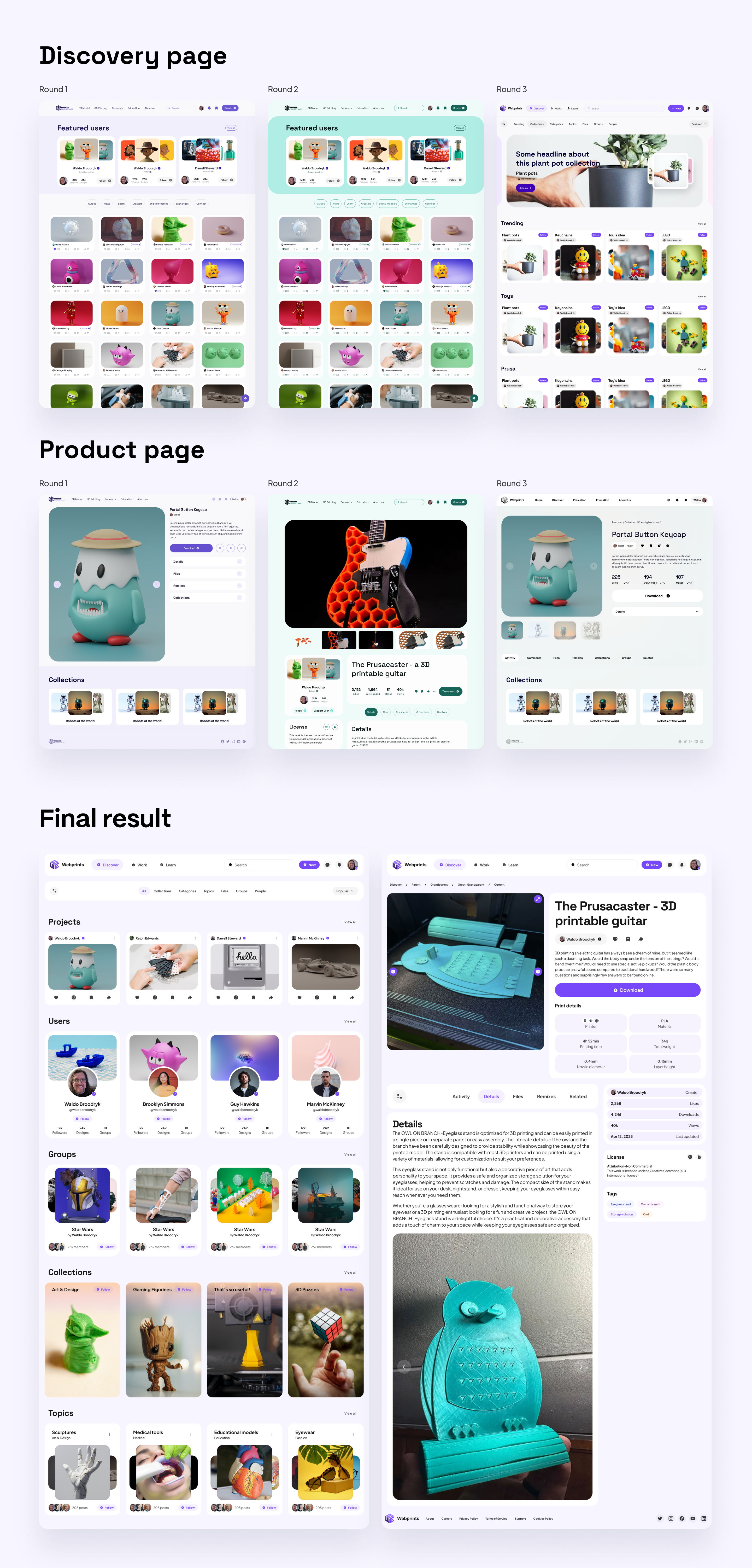
Refining for Scalability
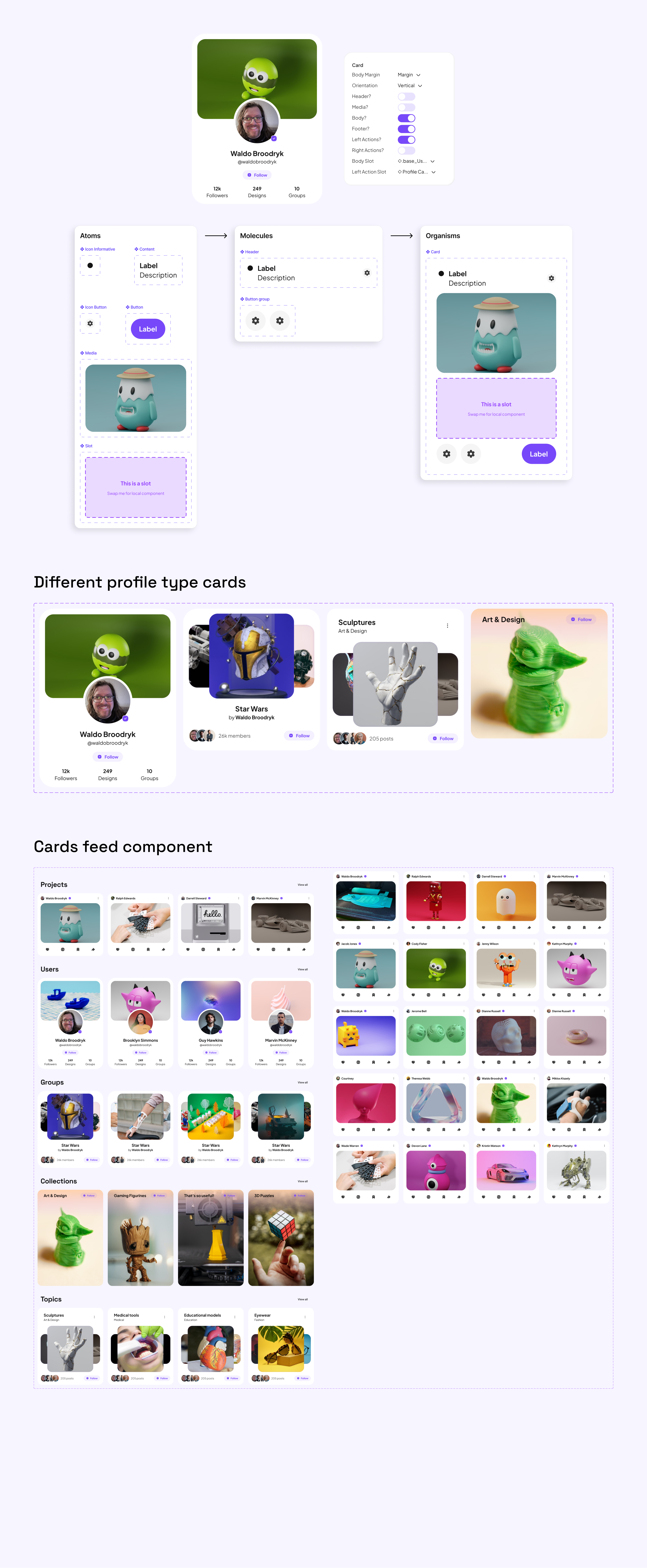
With the visual direction established, the focus shifted to refining the component library. The card and slot strategy was adopted to ensure the system could evolve with Webprints, supporting current features and future updates without requiring components to be rebuilt each time.
Cards act as the primary container with a header, body slot, and footer. Designers build body content as a local component using system primitives and swap it into the card. This kept the system consistent across the range of card types the product required while leaving room for customisation where needed.
The typography scale informed the entire sizing system, line heights, and font sizes, allowing all components to work together. The colour system was built with theming in mind throughout, maintaining accessibility standards at every stage.
Building the MVP Features
With the system validated, I completed the remaining MVP features, ensuring each screen aligned visually and integrated seamlessly with the design system. The goal was a product ready for rapid iteration: consistent, scalable, and coherent from the first release.
More projects
ShopPad: MESA
Transitioning a successful Shopify app into a standalone product meant moving from Polaris to a custom design system, while shipping new features and improving existing UX in parallel. Two years of zero-to-one product work, from field token selection to analytics, all built around merchants who needed powerful automation without the complexity.
Design System
Design systems work across fintech, web3, gaming, and enterprise platforms. Each project is different: different team size, different maturity, different constraints.