Platform
Platform
Platform
Platform
Platform
EigenLayer
EigenLayer serves as a developer platform tailored for Ethereum users. It enhances software safety, fosters Ethereum's expansion, and simplifies the testing and execution of innovative concepts.
EigenLayer serves as a developer platform tailored for Ethereum users. It enhances software safety, fosters Ethereum's expansion, and simplifies the testing and execution of innovative concepts.
EigenLayer serves as a developer platform tailored for Ethereum users. It enhances software safety, fosters Ethereum's expansion, and simplifies the testing and execution of innovative concepts.
EigenLayer serves as a developer platform tailored for Ethereum users. It enhances software safety, fosters Ethereum's expansion, and simplifies the testing and execution of innovative concepts.
EigenLayer serves as a developer platform tailored for Ethereum users. It enhances software safety, fosters Ethereum's expansion, and simplifies the testing and execution of innovative concepts.
Project
summary
Project Overview
Project Overview
Developed a robust toolkit for designing intuitive and visually appealing applications on the EigenLayer platform. As EigenLayer's influence in the Ethereum ecosystem grows, there was a clear need for a cohesive and intuitive user experience across its ecosystem. This project involved work on both the product and design system, providing a comprehensive set of guidelines, components, and resources that enable developers and designers to create consistent interfaces aligned with EigenLayer's brand standards.
Developed a robust toolkit for designing intuitive and visually appealing applications on the EigenLayer platform. As EigenLayer's influence in the Ethereum ecosystem grows, there was a clear need for a cohesive and intuitive user experience across its ecosystem. This project involved work on both the product and design system, providing a comprehensive set of guidelines, components, and resources that enable developers and designers to create consistent interfaces aligned with EigenLayer's brand standards.
Developed a robust toolkit for designing intuitive and visually appealing applications on the EigenLayer platform. As EigenLayer's influence in the Ethereum ecosystem grows, there was a clear need for a cohesive and intuitive user experience across its ecosystem. This project involved work on both the product and design system, providing a comprehensive set of guidelines, components, and resources that enable developers and designers to create consistent interfaces aligned with EigenLayer's brand standards.
Developed a robust toolkit for designing intuitive and visually appealing applications on the EigenLayer platform. As EigenLayer's influence in the Ethereum ecosystem grows, there was a clear need for a cohesive and intuitive user experience across its ecosystem. This project involved work on both the product and design system, providing a comprehensive set of guidelines, components, and resources that enable developers and designers to create consistent interfaces aligned with EigenLayer's brand standards.
Developed a robust toolkit for designing intuitive and visually appealing applications on the EigenLayer platform. As EigenLayer's influence in the Ethereum ecosystem grows, there was a clear need for a cohesive and intuitive user experience across its ecosystem. This project involved work on both the product and design system, providing a comprehensive set of guidelines, components, and resources that enable developers and designers to create consistent interfaces aligned with EigenLayer's brand standards.
Expertise
Expertise
Expertise
Product Design
Design System
Deliverables
Deliverables
Product design
Design system
Platforms
Desktop
Table
Mobile
Year
2023
The Challenge
The Challenge
The Challenge
We aimed to establish a design system in harmony with the brand's existing visual direction, which incorporates elements of Brutalism featuring high contrasting colors, typography, and scale. Our goal was to seamlessly integrate these elements into the product while prioritizing usability, responsiveness, and maintaining a focus on UX throughout the decision-making process.
Additionally, we faced the unique challenge of accommodating both light and dark backgrounds within the same system. Unlike conventional systems that offer either light or dark modes, this brand allows for a variety of background colors, adding complexity to our design approach.
Audit
Audit
Audit
Before delving into the visual explorations for their new platform, I meticulously examined EigenLayer's existing platform and marketing website to understand their current branding and design elements. This initial step allowed me to ensure that any proposed changes or additions would seamlessly integrate with their established brand identity and maintain consistency across all aspects of their digital presence.
Before delving into the visual explorations for their new platform, I meticulously examined EigenLayer's existing platform and marketing website to understand their current branding and design elements. This initial step allowed me to ensure that any proposed changes or additions would seamlessly integrate with their established brand identity and maintain consistency across all aspects of their digital presence.
Before delving into the visual explorations for their new platform, I meticulously examined EigenLayer's existing platform and marketing website to understand their current branding and design elements. This initial step allowed me to ensure that any proposed changes or additions would seamlessly integrate with their established brand identity and maintain consistency across all aspects of their digital presence.
Before delving into the visual explorations for their new platform, I meticulously examined EigenLayer's existing platform and marketing website to understand their current branding and design elements. This initial step allowed me to ensure that any proposed changes or additions would seamlessly integrate with their established brand identity and maintain consistency across all aspects of their digital presence.
Before delving into the visual explorations for their new platform, I meticulously examined EigenLayer's existing platform and marketing website to understand their current branding and design elements. This initial step allowed me to ensure that any proposed changes or additions would seamlessly integrate with their established brand identity and maintain consistency across all aspects of their digital presence.
Establishing
Visual directions
Establishing
Visual directions
Establishing
Visual directions
Establishing
Visual directions
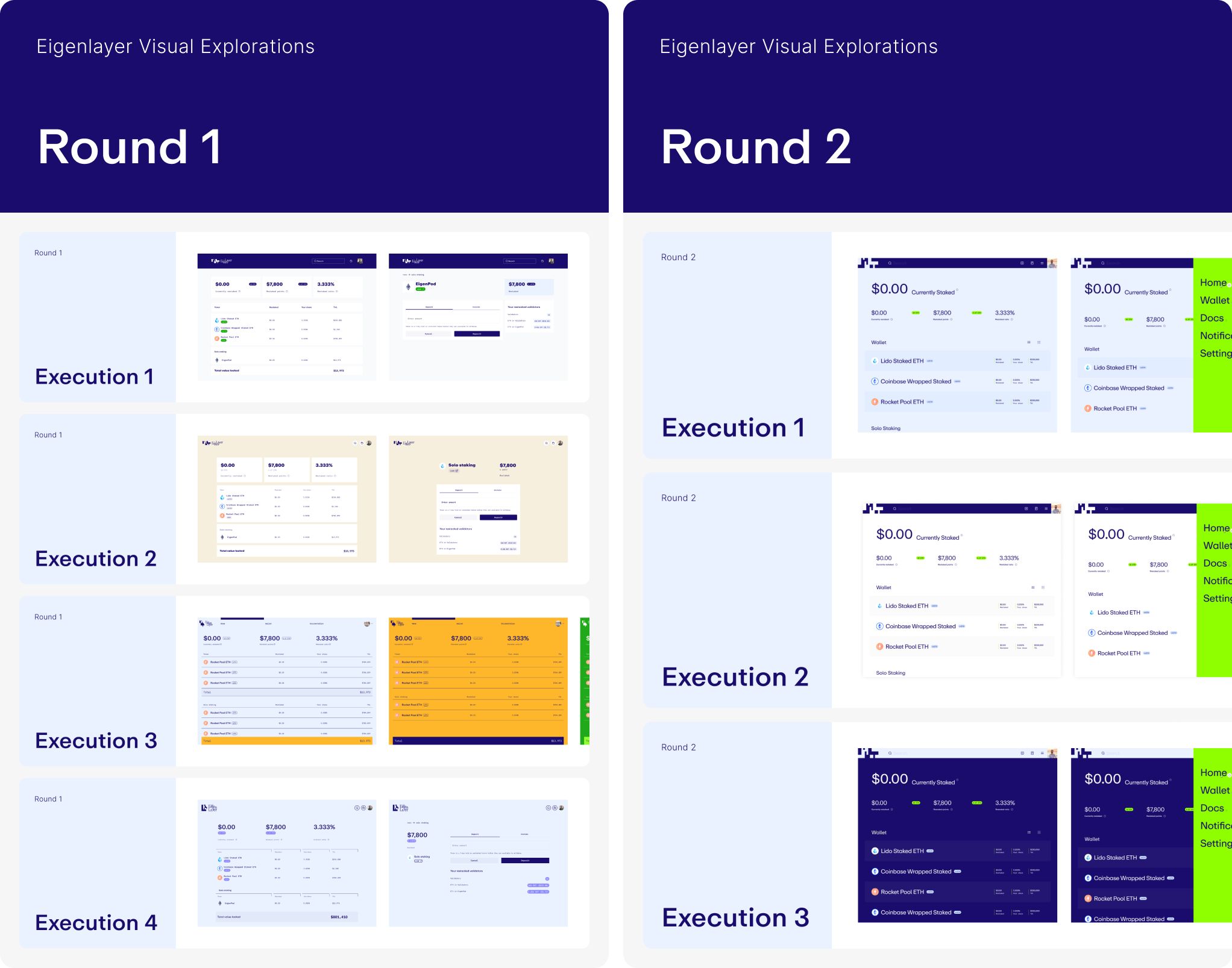
While another designer on our team focused on building the design components, I led the visual explorations based on audit findings and client communication. Within just two rounds of iterations, we successfully established a new look and feel for the product.
While another designer on our team focused on building the design components, I led the visual explorations based on audit findings and client communication. Within just two rounds of iterations, we successfully established a new look and feel for the product.
While another designer on our team focused on building the design components, I led the visual explorations based on audit findings and client communication. Within just two rounds of iterations, we successfully established a new look and feel for the product.
While another designer on our team focused on building the design components, I led the visual explorations based on audit findings and client communication. Within just two rounds of iterations, we successfully established a new look and feel for the product.
While another designer on our team focused on building the design components, I led the visual explorations based on audit findings and client communication. Within just two rounds of iterations, we successfully established a new look and feel for the product.
Accounting for
Responsiveness
Accounting for
Responsiveness
Accounting for
Responsiveness
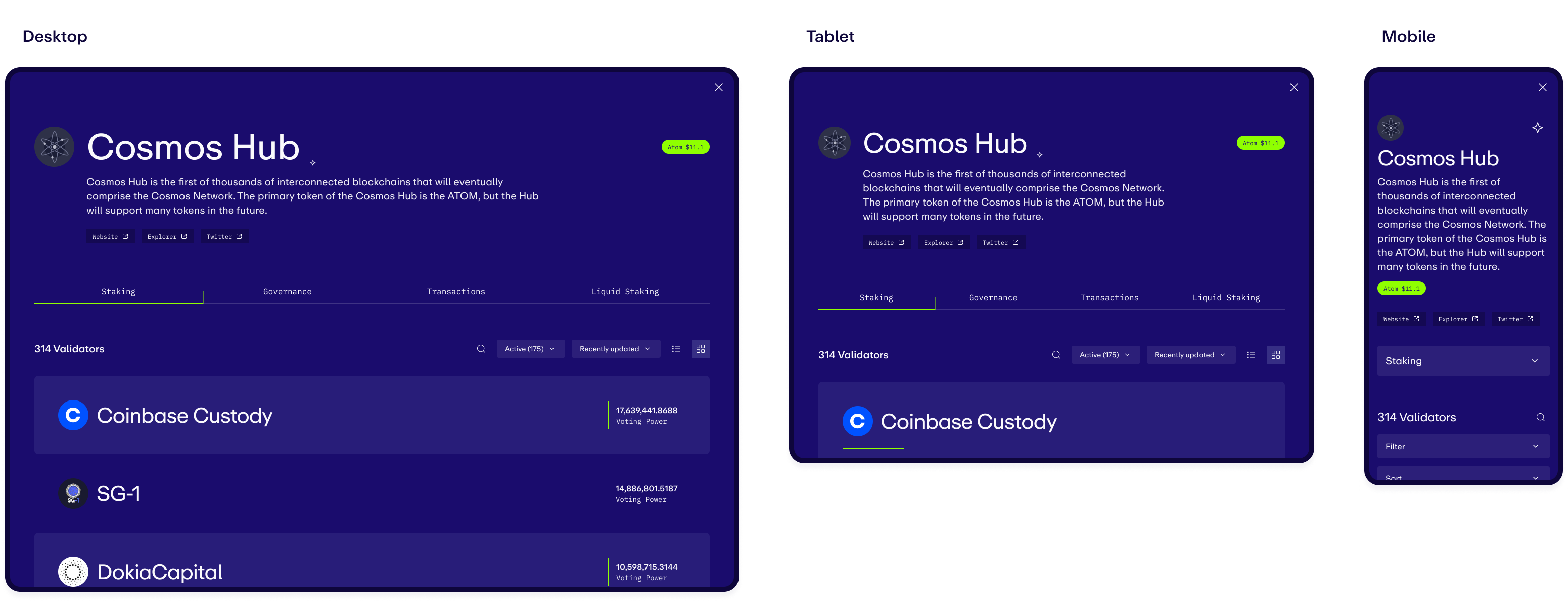
When implementing large typography, it was crucial to demonstrate its adaptability across different screen sizes, from desktop to mobile. This involved documenting the reduction in size at each breakpoint as necessary. Additionally, the team needed to illustrate how various components would adapt, such as tabs transforming into dropdown selections when space is limited.
When implementing large typography, it was crucial to demonstrate its adaptability across different screen sizes, from desktop to mobile. This involved documenting the reduction in size at each breakpoint as necessary. Additionally, the team needed to illustrate how various components would adapt, such as tabs transforming into dropdown selections when space is limited.
When implementing large typography, it was crucial to demonstrate its adaptability across different screen sizes, from desktop to mobile. This involved documenting the reduction in size at each breakpoint as necessary. Additionally, the team needed to illustrate how various components would adapt, such as tabs transforming into dropdown selections when space is limited.
When implementing large typography, it was crucial to demonstrate its adaptability across different screen sizes, from desktop to mobile. This involved documenting the reduction in size at each breakpoint as necessary. Additionally, the team needed to illustrate how various components would adapt, such as tabs transforming into dropdown selections when space is limited.
When implementing large typography, it was crucial to demonstrate its adaptability across different screen sizes, from desktop to mobile. This involved documenting the reduction in size at each breakpoint as necessary. Additionally, the team needed to illustrate how various components would adapt, such as tabs transforming into dropdown selections when space is limited.
Solution
Solution
Solution
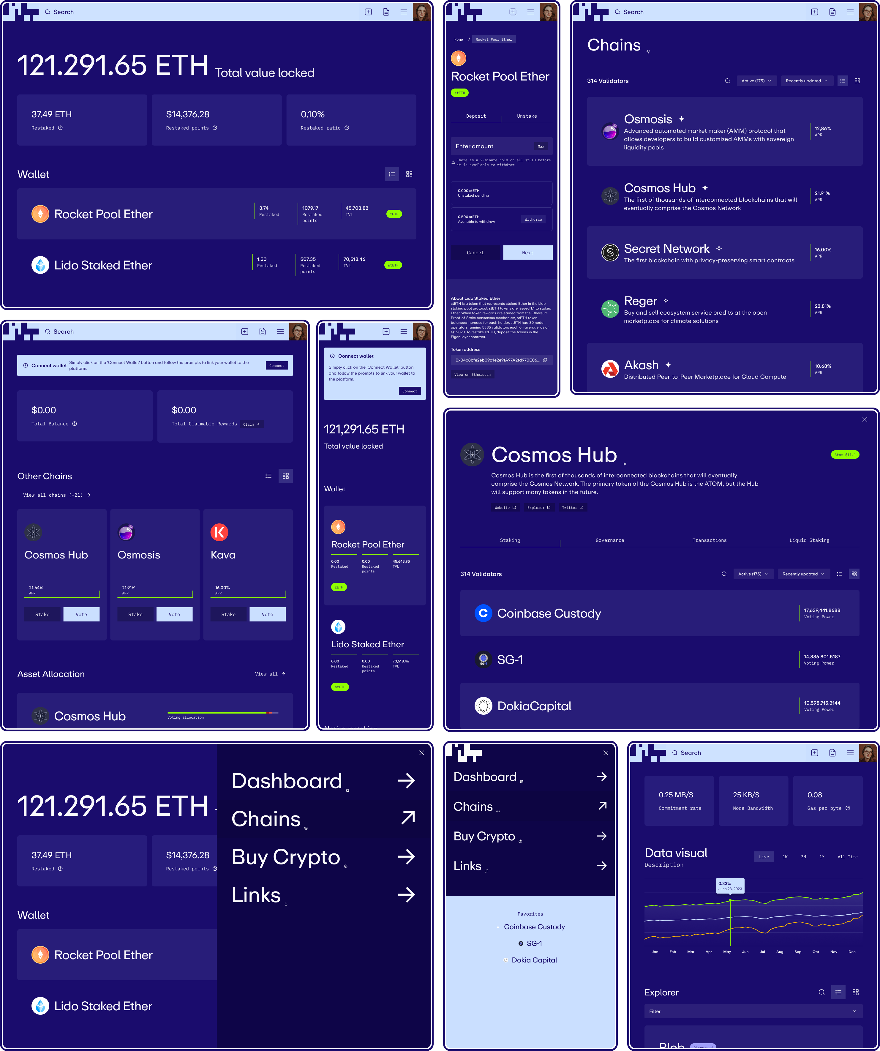
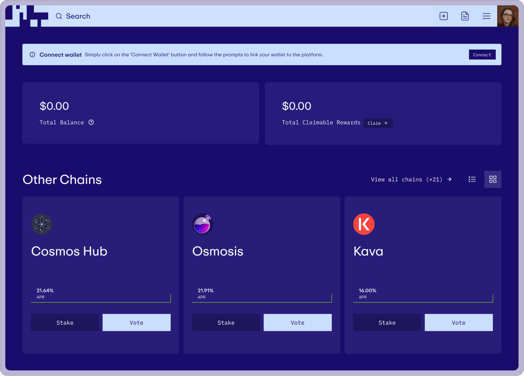
To align with brand guidelines, we incorporated high contrast in typography and color. This involved implementing a high contrast navigation bar with an enlarged search bar, accommodating both light and dark interfaces. We enhanced searchability by using blown-out typography within list items, avoiding dense tables, and providing flexibility with switching between list and card views. Accent colors were strategically applied as backgrounds for informative tags and dividers, highlighting key areas without overshadowing the interface.
To align with brand guidelines, we incorporated high contrast in typography and color. This involved implementing a high contrast navigation bar with an enlarged search bar, accommodating both light and dark interfaces. We enhanced searchability by using blown-out typography within list items, avoiding dense tables, and providing flexibility with switching between list and card views. Accent colors were strategically applied as backgrounds for informative tags and dividers, highlighting key areas without overshadowing the interface.
To align with brand guidelines, we incorporated high contrast in typography and color. This involved implementing a high contrast navigation bar with an enlarged search bar, accommodating both light and dark interfaces. We enhanced searchability by using blown-out typography within list items, avoiding dense tables, and providing flexibility with switching between list and card views. Accent colors were strategically applied as backgrounds for informative tags and dividers, highlighting key areas without overshadowing the interface.
To align with brand guidelines, we incorporated high contrast in typography and color. This involved implementing a high contrast navigation bar with an enlarged search bar, accommodating both light and dark interfaces. We enhanced searchability by using blown-out typography within list items, avoiding dense tables, and providing flexibility with switching between list and card views. Accent colors were strategically applied as backgrounds for informative tags and dividers, highlighting key areas without overshadowing the interface.
To align with brand guidelines, we incorporated high contrast in typography and color. This involved implementing a high contrast navigation bar with an enlarged search bar, accommodating both light and dark interfaces. We enhanced searchability by using blown-out typography within list items, avoiding dense tables, and providing flexibility with switching between list and card views. Accent colors were strategically applied as backgrounds for informative tags and dividers, highlighting key areas without overshadowing the interface.